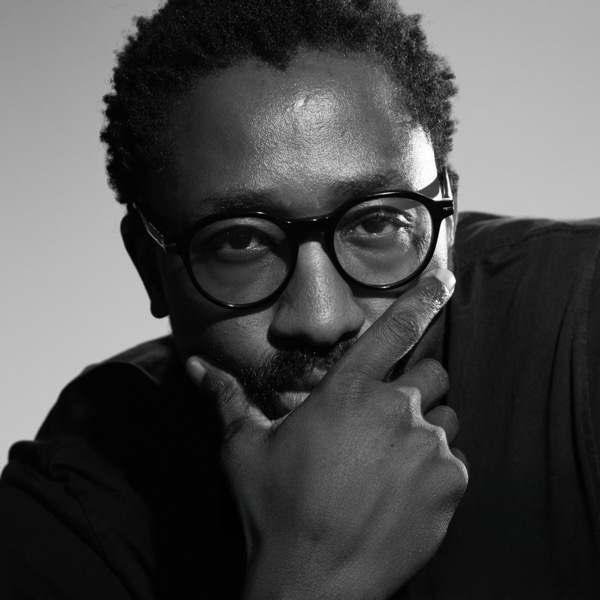
My initial inquiry was to honor my Northern Ndebele roots. What began as a search for a Northern Ndebele font/ inspiration evolved into a celebration of Southern Africa. Inspired by the geometric mural traditions of the Kalanga (Zimbabwe), Sotho (Lesotho), and Southern Ndebele (South Africa) peoples, I realized that our cultures are interwoven, sharing symbols, rhythms, and identities.
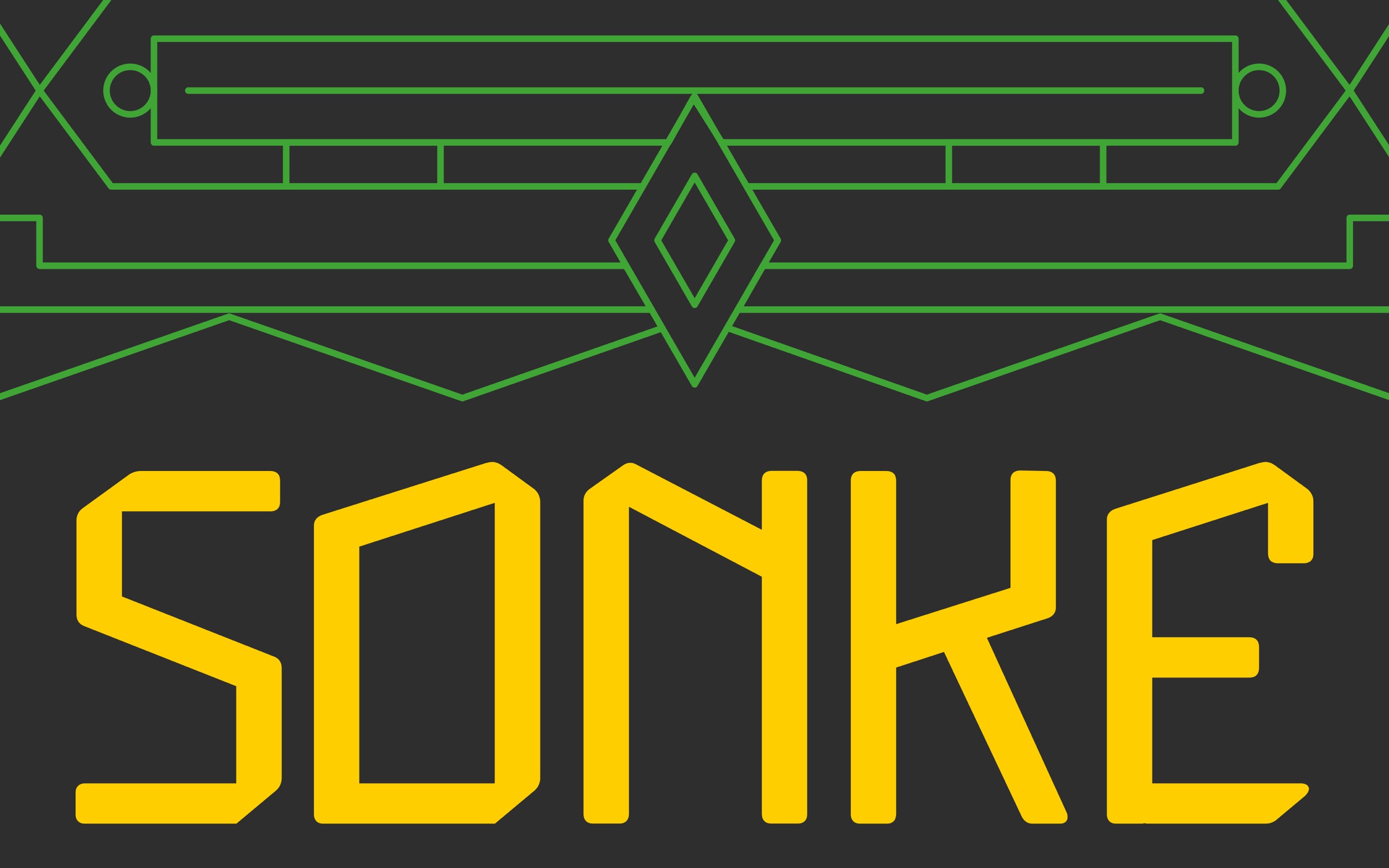
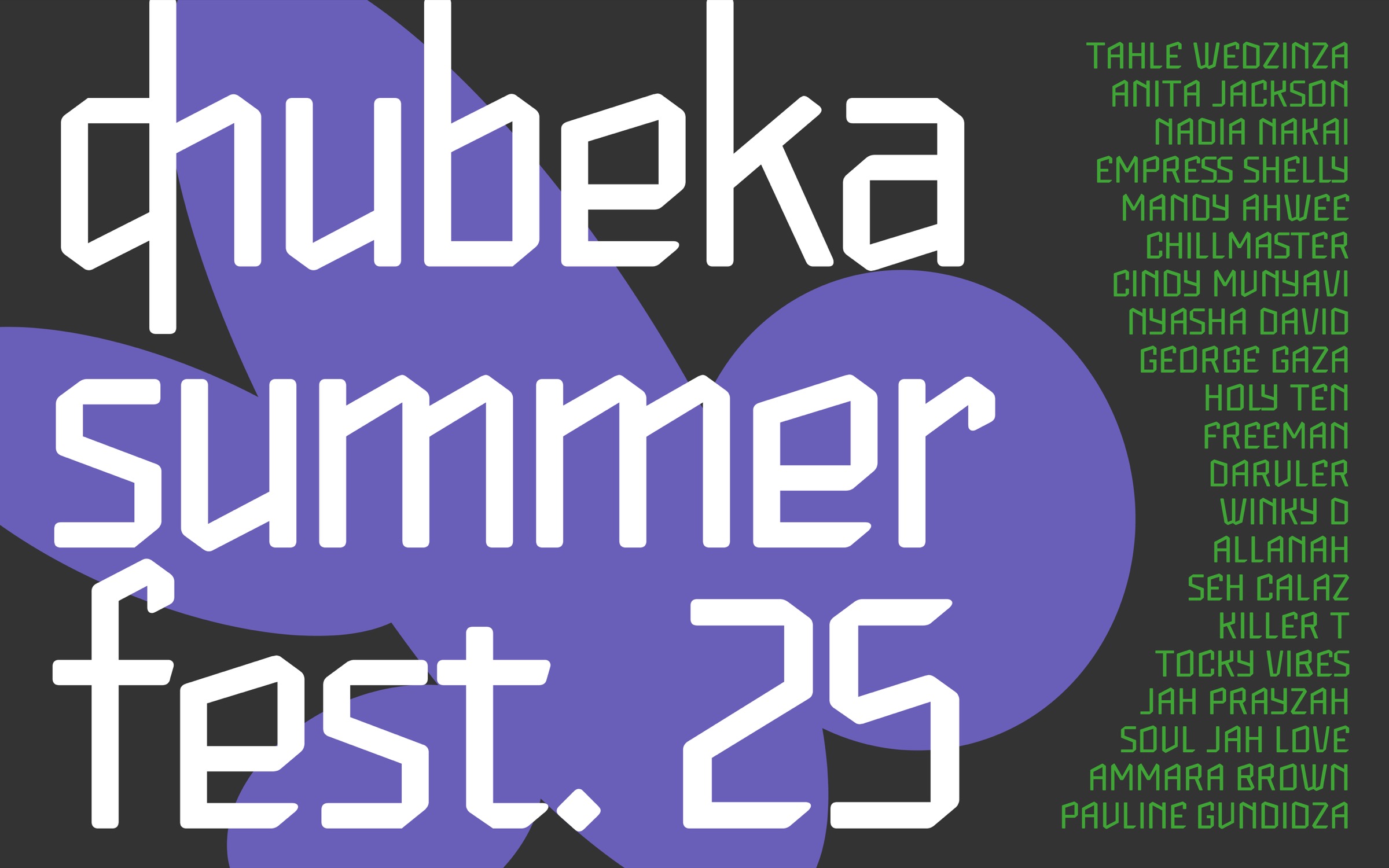
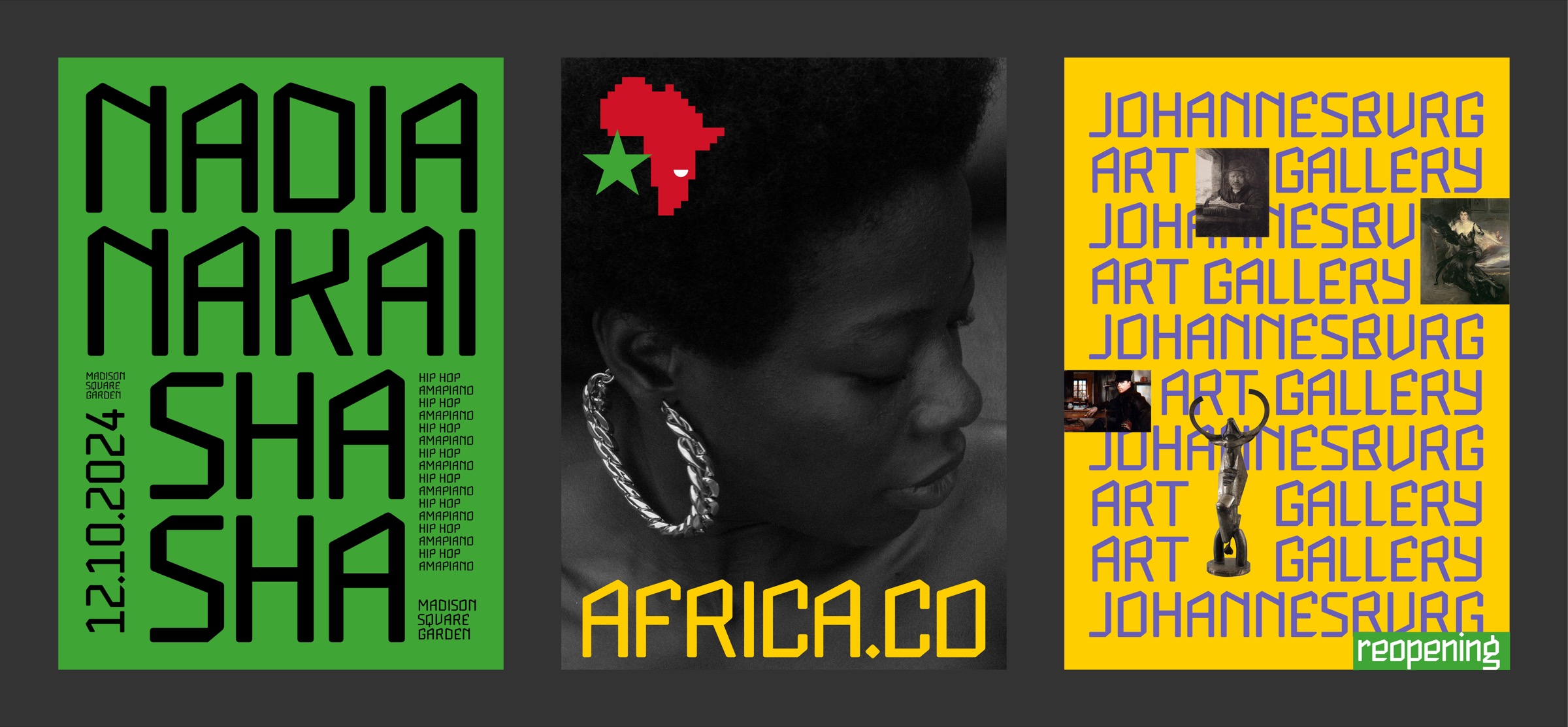
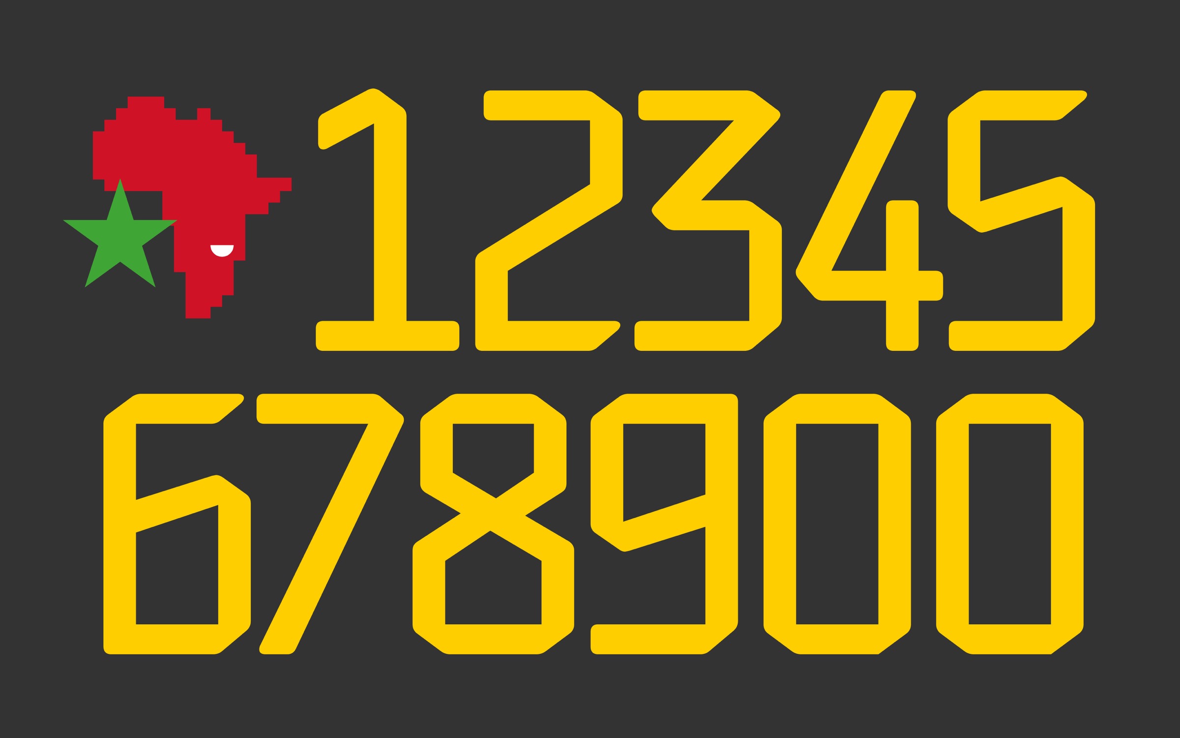
Sonke bridges display and text. It draws from the geometric and angular rhythms found in the mural traditions of the Kalanga (Zimbabwe), Sotho (Lesotho), and Southern Ndebele (South Africa) peoples. These visual languages, defined by bold symmetry, structural grids, and repeating motifs, serve as living archives of identity, now translated into letterforms. Designed for headlines, posters, and publications, Sonke carries the sharp cadence of the wall paintings that inspired it: angular yet harmonious, historical yet futuristic.
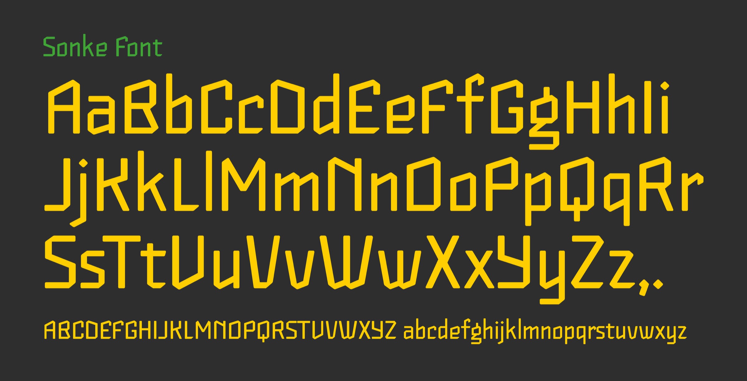
I took part in the KBI program at a time when I wasn’t too busy, which allowed me to spend time developing my characters between classes, and that was truly fulfilling. I enjoyed the lectures, especially those covering the history and techniques of type design, as well as the Glyphs workshop. I entered the program with a strong desire to create a text font. I remember working on my typeface while literally using a 6mm nib pen as a tool, writing, experimenting, and figuring out different ways to bring it to life. Along the way, I learned so much. Our cohort instructor was incredibly helpful with feedback, the more work you showed, the more guidance you received. I really appreciated that.